Project Manager web application design
EnerNOC’s web-based tool to help energy and building managers track and prioritize energy-related projects
Overview
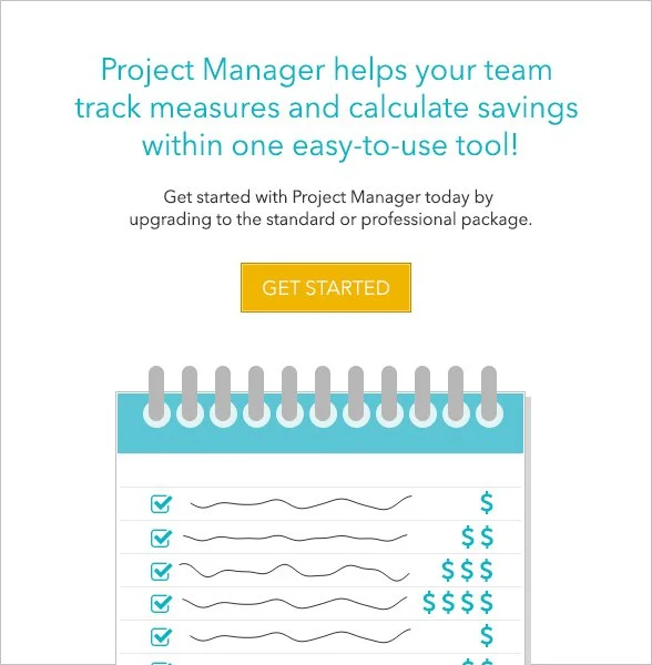
Project Manager was an application that was part of EnerNOC’s larger suite of Energy Intelligence Software (EIS). It was designed for energy managers, building engineers and others to collaborate on identifying, tracking and resolving energy efficiency measures (EEMs, or also referred to as measures), capital expenditure projects, and other related energy projects.
Challenge
EnerNOC had a legacy system in place with which EnerNOC’s energy analysts could recommend and propose energy efficiency measure (EEMs) for customers. However, the EEMs proposed by EnerNOC’s analysts were saved and tracked in a different place than energy projects proposed by customers themselves. Customers also sometimes embarked on capital expenditure projects resulting in greater energy efficiency, and these were also tracked separately.
How could we enable customers to track all energy-related projects in one place?
Goals
Keep track of all energy projects in a single place - both existing EEMs from a legacy system, and newly created projects
Handle huge volumes of projects and measures and be able to sort and filter on them by different attributes
Show a history for each measure
Integrate with new Energy Intelligence Software (EIS) landing page
Users
EnerNOC had two key personas that were defined by the entire Product and UX team through an extensive voice of the customer (VOC) interview process.
Emily, the Energy Manager

Oversees the energy management of multiple buildings or sites within an organization
Interested in how buildings are performing overall with regards to energy
Interested in financial impact of energy projects
Reports to CFO or CEO of her organization
Pete, the Problem Solver

Chief building/site engineer for a single building or campus, may have sub-engineers reporting to him
Solves problems at that one site, and is first point of contact for any issues at the site
Interested in the details and day-to-day of any projects occurring at his site
Reports to Emily
Project details
My role: Lead UX designer
Team: Product Manager, Project Manager, Engineering Lead, several Engineers and Quality Engineers
Additional design support from Visual Designer, and close collaboration with the rest of the UX design team
Methodologies: Discovery research, voice of the customer (VOC) interviews, persona definition, collaborative design, annotated wireframing, detailed design specification, user interviews, design iteration
Tools: Omnigraffle, Adobe Illustrator
Industry: Energy management, B2B SaaS
Impact
During the design process, I held several user feedback sessions with customers who were pleased with the design and said they could definitely see themselves using this tool. Many even proposed ways of using it that the UX team hadn’t anticipated.
The tool was just beginning to be rolled out on a large scale when I left the company in late 2015. But according to a former co-worker, Project Manager was one of the most used parts of the EnerNOC application suite as of fall 2016.
Background
Energy projects were being tracked in different ways, and in different places, depending on the type of project
EnerNOC had a legacy system in place with which EnerNOC’s energy analysts could recommend and propose energy efficiency measure (EEMs) for customers to carry out. However, the EEMs proposed by EnerNOC’s analysts were saved and tracked in a different place than energy projects proposed by customers themselves. Not being able to see all projects in a single place had several disadvantages:
It was very difficult to compare projects in terms of maximizing savings and minimizing payback time
It was hard for Pete and Emily to keep track of the owner and current status of a project at any given time
Project details were not all contained within one place
The goal was a tool to serve as a single source of truth for all projects - capital expenditure projects, energy efficiency measures, and other related projects all tracked in one place. This tool would:
Allow users to see EnerNOC-created measures and customer-created measures within one tool
Enable easy comparison between project proposals when deciding which to prioritize for implementation
Enable energy managers (Emily) and building engineers (Pete) and other stakeholders to collaborate on identifying, tracking, and resolving all energy-related projects in one place
Estimate and track the associated savings realized by implementing these projects
Easily see the current status and owner of a project at any time
Be integrated within the larger suite of EnerNOC’s Energy Intelligence Software
Annotated wireframes
Project Manager was one piece of EnerNOC’s new energy intelligence software (EIS) initiative, and it occupied a spot on the landing page
When I started working on Project Manager, there was a designated placeholder “card” for it on the EIS homepage, and the design team already had some initial thoughts on the content it would contain. I expanded upon that by creating this annotated wireframe to explain what each section on the card was for, and to detail the rules around each row and column of data in the table.
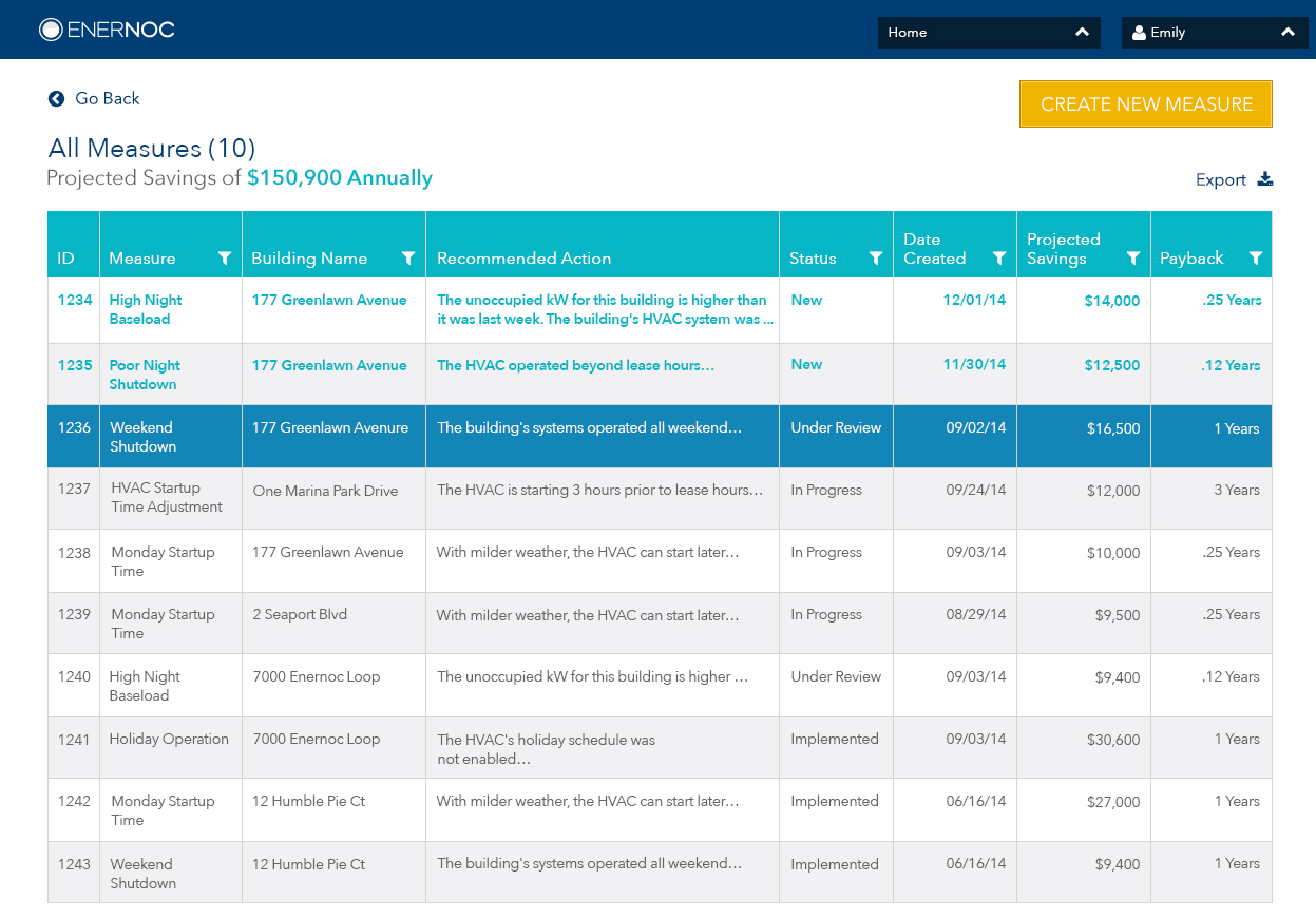
When a user clicked on “View All Measures” in the small card on the landing page, it would open this expanded list view
I created another annotated wireframe for this expanded list view, again detailing the rules for each row, column, and other piece of data that would appear in this view.
Moving from wireframes to visual mockups
We collected user feedback on our wireframes, which resulted in changes as we moved into visual design
In the wireframe, we had shown 5 measures in the table on the small card, but user feedback indicated that only the top 3 measures would really be of interest on the landing page view. So we changed this card to only show 3 measures, sorted first by status (with new measures shown first), and then sorted secondarily by projected savings.
We added a large call to action button - View All Measures. In the wireframe, this had been a small link that could have been easily missed.
We tested different messages with beta users (showing how much they could save versus how much they had already saved) to see what would most encourage them to click on the card. Potential savings were more enticing, so we increased the size of the total potential savings number to incite people to click on this card.
The visual mockup of the expanded list, or large card, also had changes from the original wireframe
In moving from the small to the large card, we had the opportunity to show more columns in the table. We collected user feedback on which attributes to display as columns, as well as the order in which to display them.
The measure highlighted here in dark teal is the one that’s currently selected.
As the project evolved, the columns and column names that we chose to show in this table also changed, reflecting both user needs and business needs.
Sorting and filtering data within the table
The number of measures at some organizations could reach into the thousands, so support for robust sorting and filtering was important
The default sort for the table was to first sort by status, and then by projected savings within each status. However, it was also useful for customers to be able to filter by status. Since there were only 5 possible statuses, a multi-checkbox approach for filtering made sense for this column.
The filtering method varied, depending on the type of data by which the table was being filtered
For filtering by date, the user was prompted to select both a start and end date from a date picker.
For filtering by projected savings and payback time, we used a slider that enabled a user to select a range between a low and high value. We also added a checkbox to allow users to include measures in the filter results for which the projected savings amount or payback period was unknown (blank).
The numbered text below the mockup with the slider examples are the design specifications that I provided to the engineering team before they implemented this feature. The QA team was also able to use these specifications as a guide for their test cases.
Creating, editing, and viewing measures
In addition to handling existing measures, the tool also needed to give users a way to create new measures
The design for creating a new measure evolved between the wireframe and the visual design, based on feedback from the product manager and from customers. The notable changes were as follows:
We put all the savings and cost figures into one column to make it easier for users to scan and compare these numbers
We prioritized the “attach image” option above the Observed Issue and Recommended Action fields. Users said they could diagnose issues more easily by looking at a graph of energy usage, as opposed to reading text describing what was happening. So we wanted to emphasize the importance of attaching an image in the UI when creating a new measure.
Any measure could be viewed in detail by clicking on it from the list view
Within the measure detailed view, the user could edit the measure, share it, or delete it. We also included an activity tracker in this view so that a user could see the history of the measure, including any status changes and comments.
In translating the wireframe of this view to a visual mockup, we realized that in the Activity section, it made sense to display the new comment field above the activity feed, rather than below it. That way, users could always add a new comment from the same place in the UI. Also the most recent items in the activity history would be shown first, instead of at the bottom of the list.
Activity feed detail
I added annotations and examples to describe the behavior of the activity feed as the list of activities grew over time.
In order to not have an increasingly long page as the activity history grew, we decided to only show the 10 most recent activities in the list. We added a scrollbar so the user could scroll to access the rest of the list once it exceeded 10 items.
Measuring success
Testing Thursdays was a weekly process to continously collect feedback from our customers
In building out the Energy Intelligence Software suite of tools, the UX team used a process called “Testing Thursdays” to collect feedback from customers on a regular, ongoing basis. The goal was to meet with 2 users every week. The rough schedule was as follows:
Monday: Determine testing goals and target users (often based on what was learned in the previous week)
Tuesday & Wednesday: Recruit and schedule users, create prototype and testing materials, create moderators guide
Thursday: Hold ~2 feedback sessions with participants
Friday: Analyze results, send out findings and recommendations to stakeholders
Much of the feedback for Project Manager was collected using this Testing Thursday framework.

Customer response to Project Manager
Customers were pleased with the design of Project Manager as it evolved, and said they could definitely see themselves using the tool once it became available.
Some customers proposed ways of using the tool that we hadn’t thought of. Our design emphasized projected savings - how much could be saved by implementing the suggested measures. This customer wanted to also show the realized savings - how much had actually already been saved. To him, this figure would justify to his bosses the cost of investing in EnerNOC’s software.
How successful was Project Manager?
The tool was just beginning to be rolled out in phases around the time I left the company. Before leaving, I set up Evergage, our analytics tracking tool, to track how many users were using Project Manager from each group to whom it was released.
One of the ways we measured success was in terms of customer engagement, so the goal was to use the analytics tool to determine how engaged customers were with Project Manager - both in terms of how frequently they accessed the tool, and how long they spent using it per session.
In fall 2016, I learned from a former co-worker that Project Manager was one of the most heavily used parts of the EnerNOC application suite.